The Background
During my "day" job I work as a web designer/developer for a fairly large internet retailer. About 6-7 months ago I was asked to add an additional field to the billing section of our checkout form. While this is an easy task and can be done in 30 seconds or less, I got the urge to reevaluate the form itself. Specifically the credit card section.
I felt like trying to redesign the UI of the form. I went against better judgement, because just the week before one of my designs for an online ad got rejected by the president of the company (who likes to see every piece of media); because it was too "out there" and not what the company represents. However I could not resist the urge so I started mocking up the form. When I was finished with the mockups I asked my boss at the time to present them to the president, and to my surprise they were approved with no revisions.
The Super Awesome New Form
So after the designs were approved I immediately got started on the code. I wrote the HTML and CSS and got it looking good in all the major browsers. Then I decided to write some enhanced front-end form validation using jQuery, because I felt that our current validation was lack luster. Below is the fruit of my labor.
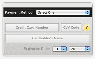 The initial state of the form(see it looks like a credit card).
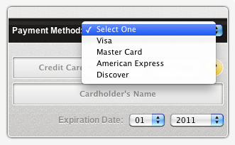 The card type selection.
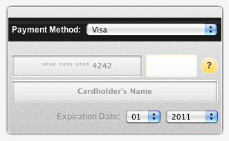 The active state of a field.
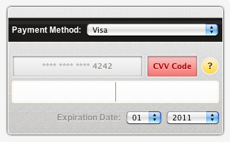 The error state of a field.
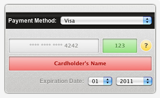 The valid state of a field.
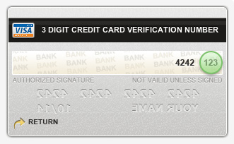 The CVV help. The whole card flipped to show the back of the card.
The end result came out pretty nice. It looked good and worked good. This went live about a week after the designs were approved. However there was a catch. Something I was afraid would happen, started to happen.
I Got 99 Problems And A Form Is One
Since the UI of the credit card form looked so different from the previous form, some customers were not sure of what to do. I would like to think that the form was intuitive enough that the customer would be able to know exactly how to use it but I was wrong...sort of.
When I say customers were not sure of what to do, what I really mean is that a small subset of customers didn't know what to do. The Customer Service department would report about an average of 6 complaints a week. This is just a tiny fraction of the amount of orders the website gets.
If only a fraction of customers were complaining then what's the big deal? This fraction is only the customers complaining. There could be a greater amount having problems and just abandoning the checkout process without calling in. To play it safe I decided to change the form back to a standard looking form. I learned that perhaps the credit card form was not the best place to try new UI elements. However on the bright side I did learn that the company I work for is open to trying out and pushing some cool UI things.

COMMENTS
There are no comments for this journal entry. Start the conversation!